Wednesday, May 27, 2009

Rendering 1- Assignment 8 Final


Assignment: Standing Figure- Create a standing figure based on a human and animal form. The basic form must be organic, with at least four distinct surface textures included and carefully rendered. Some parts should be metallic. Use a hot main light source and a cool reflected light. Due Wednesday, May 20.
This project was very challenging in the sense where I needed to concentrate on the light source as well as the way the light source will read when it hits a specific type of texture. I did a lot of research for reference in order to complete this final project. This project proved to be the most challenging for me. I chose to do a half female; half black widow spider creature with feather-like hair texture and liquid metal arms. I am not too happy with the results, but If I keep at it I think I can do better. I named the character "Blood Widow".

Typography 1- Assignment Final


In this assignment I was to create a workbook of all my typography projects from the semester. My book was 145 pages long! I made the design simple so that each project could stand alone on it's own page. This class was AWESOME! I had a lot of fun with the typographic drills although it was CRAZY!! Here are some of my typographic drills.

Monday, May 18, 2009

Rendering 1- Assignment 7


Assignment: Color still life- Create a still life of fruit. Use at least four kinds of fruit. Use Acrylic and Gouache. Make half the fruit in a non-fruit texture. Due Monday, May 4.

In this project I picked an apple, a banana, a small watermelon and a guyabano. I tried to choose two types of fruit that were interesting enough as they were in texture and two that were simple in texture. The two that were simple and texture (apple and banana) I chose to change the texture. I made the apple look like human heart tissue and the banana look like a cigar. I found this project tested my ability to, not only paint, but paint realism. I feel I learned the most from this project.

Friday, May 1, 2009

Rendering 1- Assignment 6


Assignment: Mask 2- Render the same mask with a texture of your choice. Render the mask in a gouache wash and detail in prisma color pencils. Use two light sources, one warm and one cool. Paint a flat black background behind the mask. DUE MONDAY, APRIL 20.
Again this assignment kicked BUTT! Just when I thought it couldn't get any COOLER, my instructor throws a texture into the warm and cool color mix. I had a lot of fun finding what texture I wanted to do. I went with Dart Frog skin texture. The trick was to make that specific texture look like it was being lit by a warm and cool light. Prisma color was easier to work with, but did not seem to have the same crispness as gouache, but I think it turned out pretty well. I got some good feedback from the instructor. I really think I can do a series of these masks. Could be fun! A mask for every mood.

Typography 1- Assignment 5


For this assignment I was to re-create an already famous corporate logo. I chose to do comic book companies. After I chose the logos I was going to remake I used one font out of the already illustrator traced fonts and created the company name out of that style. This was more difficult then it sounds. I was unable to use color or graphics. I could only use the specific font style and fill it black. Some I thought looked alright. I found that there were some spots I just wanted to make up, but then I would be breaking the rules. So, I kept to the policy and I got what I got.

Rendering 1- Assignment 5


Assignment: Mask 1- Select a Halloween mask based on a human face. Paint the mask matte white. Render the mask in gouache. Use two light sources, one warm and one cool. Paint a flat black background behind the mask. DUE MONDAY, APRIL 20.
This assignment was AWESOME! I had a lot of fun with the dynamics of this assignment from finding the mask to drawing the mask on illustration board then into the actual painting of the mask. I found that I had trouble actually stopping at a point. I really need to work on finding a point and STOPPING! Anyway, I was pretty happy with the finished product and can see myself doing a series of these masks. I like the way they eerily stand out of the darkness. I found that gouache is a pain in the BUTT to work with, but you can really get good crisp lines and detail.
(note) I was worried about walking with it in the rain cause gouache does not keep well.

Typography 1- Assignment 4


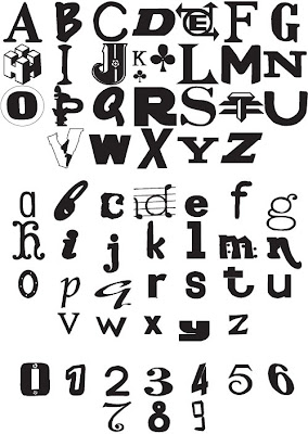
For this assignment I had to take all of the alphabet sets that I created and pick the best set and then live trace it on Illustrator for a final black and white mixed font alphabet. This was a pretty easy assignment. There wasn't much to it, but I did learn more about Adobe Illustrator. Live trace is good for quick graphic logos.

Rendering 1- Assignment 4


Assignment: Morning room scene- Using 2 point perspective, render the scene on coquille board using a black prisma color pencil and a full range of values and smooth shading. The room should look as if it is being dimly lit by light that is coming from a window. DUE MONDAY, MARCH 23.
This assignment was the most challenging thus far. When I bought the coquille board I thought to myself "This is some BULL!" This type of illustration board is really toothy and textured so when I was shading with the prisma color pencil I found that I really had to press hard in order to get the dark values as dark as possible. "A little elbow grease," says my instructor. I say a sh*t load of elbow grease and 10 prisma color pencils for one drawing. After all was said and done the picture did not come out the way I wanted it to, but turned it in so that I can learn to stop myself instead of rendering things to DEATH! This was a great project for humility. I did, however, enjoy learning two point perspective and also creating my concept. I chose to do a dungeon scene with a knight coming to the rescue of a damsel in distress. The dim light source does not come from a window, but a port hole into the dungeon. I did get a pat on the back for originality. I think I would like to take the same concept and redo the drawing in paint on a NORMAL illustration board.